With smartphones outnumbering desktops and people rushing to their phones for practically everything, businesses stand a good chance of getting noticed. As of February 2024, mobile devices accounted for over 65% of all website traffic worldwide.
This means that if you run a business and your website isn’t optimised for mobile users, you’re missing out! Today, users want more than just ‘responsive designs.’ They want websites that perfectly align with their expectations.
But how do you optimise your website services for marketing effectively? Let’s find out!
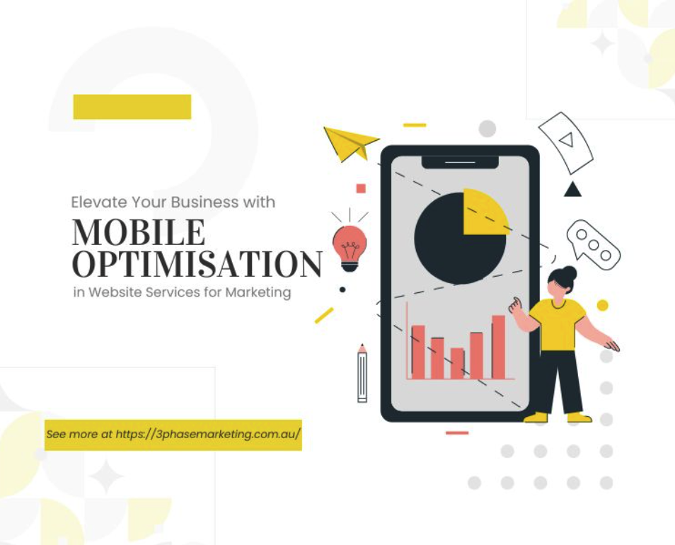
Why Mobile Optimisation is Crucial for Modern Marketing
First things first, it’s crucial to understand why mobile optimisation takes your marketing efforts a step ahead.
Let’s be real: shoppers are all over the place, checking out new products around the clock. This creates the challenge of giving them a hassle-free shopping experience, no matter what gadget they are using. If retailers want to score sales, the best way is to acquire a ‘mobile-first’ approach and act on it.
With the world being more fast-paced than ever, nobody wants to wait around for your application to load. If your competitors have mobile-optimised websites and marketing strategies, and you don’t — guess who’s going to come out on top?
For any marketer wishing to thrive in today’s era, you can’t achieve your marketing goals unless your site satisfies the visitors.
The Role of Mobile Optimisation in Enhancing User Experience
A website that doesn’t offer a smooth experience is one where visitors won’t stick around for long and certainly won’t come back. On mobile devices, users are navigating smaller screens, where they can effortlessly read your content and tap on links.
However, if they have to battle with tiny text, misplaced buttons, and a cluttered layout, they go running to your competitors. So, mobile optimisation makes or breaks your deals. Here’s how it can enhance user experience:
Improved Website Speed
When it comes to designing your site for a better user experience, page speed optimisation takes the top spot. If a website takes ages to load on a mobile device, users tend to look elsewhere. For instance, websites with flash elements that have slow loading times are typically a no-go in today’s mobile-friendly world.
An average website takes 8.6 seconds to load, which is way more than 3 seconds— the time that 40% of users wait before bouncing back. That’s why an average website that occupies the first spot on Google has an average loading speed of 1.65 seconds.
If your website is optimised for mobile users, they’re more likely to stick around and read your content, which, in turn, can lead to sales. Google also favours quick load times, so it’s a win-win.
Better Audience Engagement
Once your website has a more mobile-friendly design, you can engage more visitors to explore what you have to offer. This way, users can easily like, share, comment, or click on links without any trouble.
It goes without saying—the more engaged your audience, the higher the chances of your business thriving. For instance, a complete website redesign by 3 Phase Marketing for an industry leader increased users by 28% year over year.

Improved Search Engine Optimisation (SEO)
Back in the day, mobile SEO and regular SEO did not have a profound impact on one another. However, in recent years, Google has started to monitor your website’s mobile-friendliness when ranking it in search results. This means that if your website isn’t easy to use on phones, you could be setting your business up for failure.
Additionally, you may have the best SEO driving traffic to your site, but if it’s not mobile-optimised, you’ll struggle to convert visitors into customers. Mobile users expect an effortless experience, so if they encounter a clunky site on their phones, they bounce off, hurting your ranking on search engines.
Higher Average Time On-Site
When you prioritise Mobile UX (user experience), customers spend more time on your site. This higher average time maximises their chances of conversions. Alternatively, if your first impression is decent, they’re twice as likely to return to your page.
Best Practices for Mobile-Friendly Website Design
Innovative UX Design Strategies can bring more traffic to your business than all other factors combined. To make sure your digital assets are optimised for users on phones, here’s a rundown of the best practices to follow:
Implement a Responsive Design
As mentioned earlier, mobile users need a responsive design that fits perfectly with the device they’re operating. Whether it’s a desktop, laptop, or mobile phone, you must ensure your customers get a consistent experience with your brand.
Work on Speed Optimisation
The speed of your page is a make-or-break factor when it comes to mobile optimisation. To improve the speed, start by identifying pages with excessive RTRs and aim for less than 50. Then, create a page load strategy, compress things where possible, and build accelerated mobile pages to strive for better speed.
Optimise the Images & Fonts
Image optimisation and font optimisation are essential when optimising your mobile page. This means using fonts that are easy to read and avoiding small, complex fonts. It’s equally critical to use images that fit the screen size of your user’s devices and faster loading images to enhance the overall experience.
Analysing the Link Between Mobile Optimisation and Conversion Rates
Thirty-seven per cent of customers are more likely to purchase from a mobile-responsive website.
At its core, mobile optimisation is about maximising conversions from mobile users. By adding features like click-to-call buttons and GPS directions in your optimised landing pages, mobile sites make it effortless for users to engage with your business. This, in turn, leads to higher lead capture rates and increased conversions. With every one-second increase in website loading speed, the conversion rate increases by 7% on average.
Additionally, mobile-optimised websites load faster and provide clearer calls to action. With streamlined checkout processes and user-friendly interfaces, users can easily complete actions and make purchases or fill out forms on their smartphones. Ultimately, businesses that prioritise mobile optimisation convert mobile users into loyal customers.


